The China Dish journal / A closer look
When a teapot carries words
Yixing teapot inscriptions bring written words into the design of a clay vessel. They can include a pot’s name, a poetic text, a dedication or a maker’s mark, so reading them involves more than finding a translation. A teapot in Beijing’s Palace Museum offers a useful starting point: its large name and longer text occupy […]
Yixing teapot inscriptions bring written words into the design of a clay vessel. They can include a pot’s name, a poetic text, a dedication or a maker’s mark, so reading them involves more than finding a translation. A teapot in Beijing’s Palace Museum offers a useful starting point: its large name and longer text occupy opposite sides, while other details belong underneath or inside the lid.
Those separate surfaces let us look at the words, their arrangement and the people named on the pot without treating every mark as the same kind of message.
A teapot’s name isn’t necessarily a poem
An inscription is writing on an object; poetry is one possible kind of writing. A name identifies the vessel, a dedication names someone addressed by the writer, and a maker’s mark records another association. They may share a pot while doing different jobs. Calling them all a poem would hide those differences before we’ve begun to read.
The Palace Museum’s Feihong Yannian teapot makes this distinction visible. The museum dates it to the Jiaqing reign of the Qing dynasty and associates it with the potter Yang Pengnian and Chen Mansheng, a scholar and calligrapher. Its record locates the short name on one wall, a longer inscription on the other, a Pengnian mark inside the lid and a flying goose on the base.
For this pot, the most helpful question is therefore specific: which surface are we reading? A translated name can’t stand in for the longer inscription, and the main wall doesn’t show the mark inside the lid. The Palace Museum’s object record supplies the separate views and readings needed to keep them apart.
The Yixing reading guide places this subject alongside clay color and studio objects, giving the written surface its own route into a tradition that also includes the vessel’s material and practical form.
Three large characters name the teapot
The short name, Yannian hu (延年壶), means “longevity teapot.” The museum identifies its script as clerical script, a style of Chinese writing. Across this face of the pot, the three characters are large and widely spaced, with plenty of bare clay below them. The text doesn’t fill the wall from shoulder to foot.
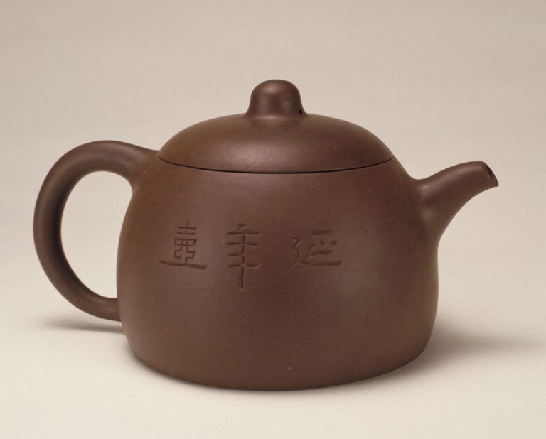
The space around the characters matters even before their meaning becomes clear. Compare their height with the body, then follow the horizontal strokes across the curve. The writing is large enough to stand apart from the small knob and lid seam, but it leaves the vessel’s rounded belly easy to see. Here, lettering and form can hold the eye at the same time.
I read the short name first because it gives me something definite to carry around to the other face. Once I know these characters name the pot, I don’t have to force them into a poetic sentence. Their broad spacing has a visual effect of its own.
The longer inscription changes the pace of looking
The opposite wall gives the reader a denser field of writing. The Palace Museum identifies the longer text as running script, a more flowing style than the clerical script used for the name. The inscription ends with a dedication naming Mansheng as the writer for Zhihou. That dedication has a different role from the large vessel name.
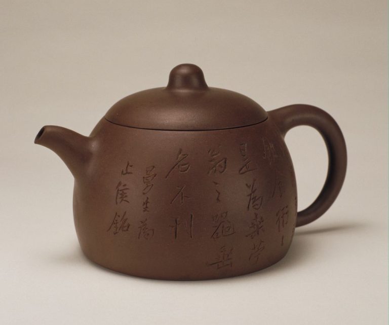
The smaller strokes ask for a closer look. Their columns occupy more of the wall, and their changing shapes create a different rhythm from the three broad characters on the first side. It’s possible to notice that shift without claiming to read each character. A transcription tells us what the marks say; this view shows how much space they take.
Poetry and calligraphy also raise different questions. A poem concerns the words and how they work together; calligraphy concerns the forms and movement of the written strokes. A poetic text can be written in different hands, while a short name can receive careful calligraphic treatment. On this vessel, the contrast between the name and the longer text makes that distinction easier to grasp.
The teapot’s goose belongs to the underside
The pot’s pictorial decoration adds another surface to this reading. According to the museum, a flying wild goose is carved in relief on the base, with the characters for longevity placed on either side of its neck. The main photographs above don’t show that underside. The museum’s base view and its description provide the evidence for it.
Putting the image underneath changes what a single front view can tell us. A photograph of the three-character name gives a clear view of one wall, yet it leaves the goose out of sight. A full account of the design has to include both. The picture isn’t simply a motif squeezed into the gap beside the large letters.
That placement is why I keep the pot’s surfaces separate in my notes. The name, flowing text and goose don’t all compete for the same patch of clay. Each has room in a different place, and the vessel gathers them into one object.
Makers and writers leave different teapot inscriptions
The names on those surfaces lead from looking to attribution. The Palace Museum describes Yang Pengnian’s work with scholars who contributed poetry and pictures, including his collaboration with Chen Mansheng. Making the vessel, composing words, writing them and cutting a design are distinct activities, even when they contribute to the same finished pot.
A signature doesn’t by itself tell us who carried out every operation. The Pengnian mark belongs inside the lid in the museum’s account; Mansheng’s dedication accompanies the longer text. Keeping those locations and roles clear is more useful than assigning the entire object to whichever name is easiest to recognize.
The two faces give us a smaller task: look again at the amount of clay left open around the large name, then compare it with the tighter columns on the reverse. The words have changed, and so has the way the wall asks to be seen.